
What This Covers
Bagasse label stock. How it looks on shelf, how it behaves under ink, what to change in artwork before files go out and why the adhesive underneath decides more than the paper on top.
Who This Is For
Brand owners choosing a sustainable label stock who want the premium look and have not been told what the material does on press.
Core Finding
Bagasse delivers a cream, tactile, premium surface. It also absorbs ink faster than the coated papers most artwork is built for, so type weight and ink density decide whether the look survives.
Bottom Line
The facestock is one layer of three. The adhesive sets the disposal route, whatever the paper is made from.
This article does not contain affiliate links.
Bagasse is the sustainable label stock we point clients to when they want the premium look. It is the fibrous residue left after sugarcane is crushed for juice, and as a label facestock it comes off press cream-toned, uncoated and lightly textured. On shelf it reads as artisanal rather than as recycled. Two things decide whether a brand gets that result. The stock absorbs ink faster than the coated papers most artwork is built for, and the adhesive underneath does more to set the label’s disposal route than the paper on top of it.
Sustainable label stock has stopped looking like a compromise
For years the trade-off was real. A brand that wanted its packaging to signal environmental care took a facestock that was brown, flecked and inconsistent from roll to roll. It photographed badly, it fought fine type, and it could make a carefully priced skincare product look like it shipped in a sack.
The shortlist now looks different. Hemp facestock holds foil and embossing well and carries a soft off-white tone. Grass paper shows visible fiber and reads as unmistakably natural at a glance. Recycled felt and cotton stocks at high post-consumer content give the heavy woven finish that wine and gourmet labels have used for decades.
Bagasse is the one that comes up most often in our shop when a client wants sustainable and premium in the same sentence. It is also the one worth going into properly, because how it behaves under ink is where the useful detail lives.
What bagasse label stock looks like on shelf
Bagasse is what remains after sugarcane goes through the mill. The juice goes to sugar and the crushed fiber, which was historically burned or dumped, goes into paper.
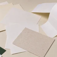
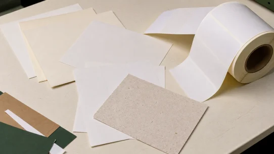
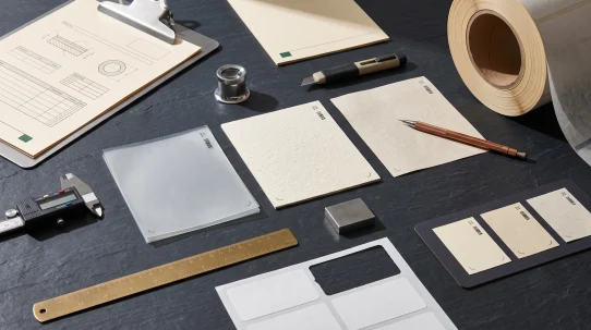
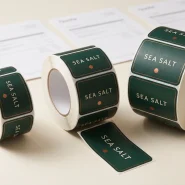
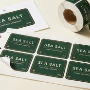
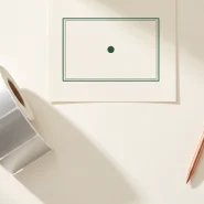
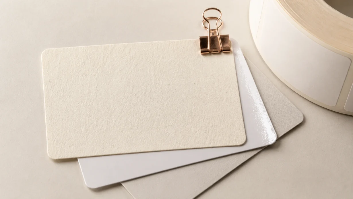
As a label stock it lands in a specific visual register. The tone is cream to warm off-white rather than the grey-brown of older recycled paper. The surface carries a fine matte texture a buyer notices with a thumb before noticing it with their eyes. It is uncoated, so there is no shine to catch a store light.
Where it helps: coffee, honey, preserves, small-batch spirits, botanical skincare, candles. Anything where the buyer is meant to believe a person made it.
The line worth understanding is where kraft fails and bagasse does not. Kraft reads as farm stand and shipping material. Its strong brown tone pulls every color printed on it towards mud. Bagasse sits lighter, so colors stay closer to what the designer drew, and the texture registers as paper quality rather than as raw material.
Run the thumbnail test before committing. Shrink the label to the size it appears at in a marketplace listing. Bagasse survives that test because at small size the color and the type are doing the work, not the texture. A design that needs the texture to look premium is not finished.
How it behaves on press
This is where the stock costs a brand its first proof.
Uncoated natural fiber is absorbent. Ink hits it and goes in rather than sitting on top, and it goes in faster and further than on the matte, semi-gloss and gloss papers that handle most of our work. The effect has a name in print. Dot gain: every printed dot spreads slightly as it lands, so lines thicken, the gaps between them close and dark areas go darker than the file says.
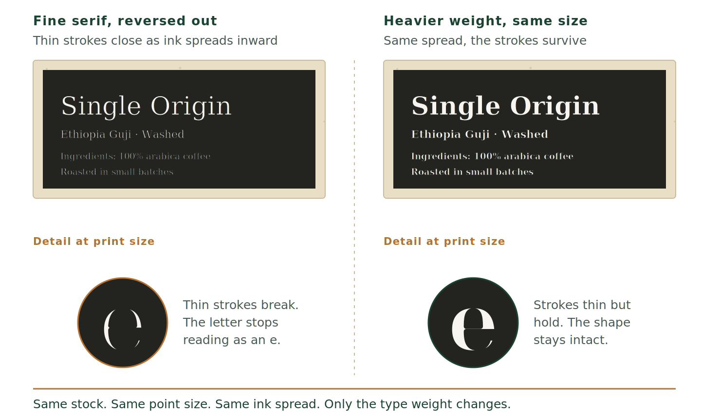
On a bold, open design that effect is invisible or even flattering. On fine detail it removes the detail.
Production Case
We ran a batch of bagasse labels for an artisan coffee roaster whose artwork used a dense dark background with fine serif typography. Because the uncoated sugarcane stock absorbs ink the way a sponge does, the heavy coverage produced dot gain on press and the ink spread into the fibers until the delicate text filled in. To hold the premium look we pulled the prepress ink densities back and advised the client to move to a heavier font weight so the type kept a crisp edge.
None of that is a defect in the stock. It is a property, and it is knowable before artwork goes to print rather than after.
Building artwork for a stock that drinks ink
Five adjustments cover most of it.
Type weight. Hairline and light weights at small sizes are the first casualty. A medium or semibold at the same point size reads cleaner on bagasse than a light weight one size larger.
Reverse type. White text knocked out of a dark field is the hardest thing to hold. Ink spreads inward from both sides of every letter, so the enclosed spaces inside letters fill first. If reverse type is central to the design, set it larger and heavier than instinct says.
Coverage. Dense dark backgrounds across the whole label push the stock to its limit and cost more ink. Open designs with the paper showing through print better, cost less and look more expensive on this material anyway.
Photography. Detailed photographic imagery goes soft. Line art, illustration and flat color hold.
Ink density. This one belongs to the printer rather than the designer, and knowing it exists changes the conversation. Ask what density limits the shop runs for the stock.
| Stock | Ink absorption | Type that holds | Suits |
|---|---|---|---|
| Gloss paper | Low. Ink sits on the surface | Light weights and fine serifs | Photographic imagery, bright color |
| Semi-gloss | Low to moderate | Most weights | General retail, mixed artwork |
| Matte coated | Moderate | Light weights soften a little | Muted palettes, text-heavy labels |
| Bagasse, uncoated | High | Medium and heavier | Open layouts, line art, flat color |
The step that saves the most money is asking for a printed sample on the actual stock before artwork locks. A digital proof, or the same design printed on coated paper, tells a brand almost nothing about how bagasse will hold its type.
The half of the label nobody specifies
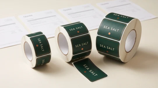
A self-adhesive label is three layers. The facestock a brand chooses and looks at, the adhesive that rarely gets discussed and the liner that gets thrown away at application.
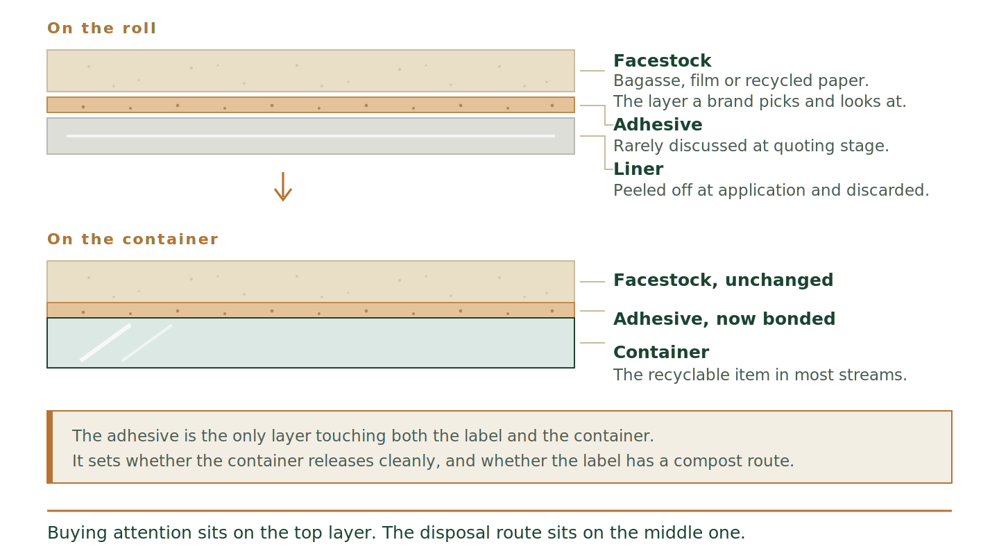
Buying attention concentrates almost entirely on the top layer, which is the layer that decides how the label looks and close to nothing about where it can go afterwards.
Put a standard permanent acrylic adhesive on a bagasse facestock and the label as an object is not compostable, whatever the paper is made from. The same logic runs through the rest of the construction. A gloss laminate applied over bagasse for durability cancels both the texture the brand paid for and the disposal route it planned. Inks and varnishes count as well.
Three constructions worth knowing by name.
Wash-off adhesive. Releases the label from glass or PET in the hot caustic wash at a container reprocessing plant, so the container goes back into the recycling stream cleanly. Relevant where the container is the recyclable item rather than the label.
Compostable adhesive. Formulated to break down under industrial composting conditions alongside the facestock. Relevant where the packaging itself is heading to a compost facility.
Standard permanent acrylic. The default, the cheapest and the right answer for most applications, as long as nobody is planning a compost claim on top of it.
The trade-offs that arrive with each of those are covered in Sustainable Label Materials: What Changes in Production Before You Switch.
What a claim rests on
Paper made from agricultural waste supports one kind of statement. A finished label breaking down in a commercial compost facility is a different statement resting on different evidence.
In the US the reference point is the FTC Green Guides, 16 CFR Part 260. They are guidance rather than regulation, and they set out how the Commission reads environmental claims under Section 5 of the FTC Act. The current version dates from 2012. A review opened in 2022 drew thousands of comments and has not produced a revision, so the 2012 text is what applies while that review stays open.
Two points from it shape label copy. An unqualified compostable claim carries an expectation that the item breaks down in a safe and timely way, and where facilities are not available to a substantial majority of consumers where the item sells, the guidance points towards qualifying the claim rather than stating it flat. A general phrase like eco-friendly, standing alone with nothing specific behind it, is the pattern that draws attention.
The North American test benchmark for industrial composting is ASTM D6400. It describes 90 percent biodegradation within 180 days and disintegration within 84 days under commercial composting conditions, and it speaks to the whole construction rather than to the paper on its own. BPI runs the best-known third-party verification program against it in the US, and the Compost Manufacturing Alliance tests against real facility conditions. In Canada the Competition Bureau enforces truth in labeling, and several US states now look for independent verification behind compostability claims.
None of that tells a brand what to do. It describes what the words rest on. Our own position with clients is the one this article takes: we build the label and explain how the construction behaves, and the claims on the finished package stay the brand’s decision, taken with its own advisers.
How to brief a printer for this
Order matters more than the questions themselves.
Ask in this order
- Name the disposal route firstRecycling, industrial composting or neither. That answer changes the adhesive before it changes anything else.
- Ask what adhesive pairs with that routeOn the facestock you want. Then ask what it does to minimum order quantity and lead time. The sustainable construction is often the slower one.
- Ask for a printed sample on the actual stockNot a digital proof, not the same design on coated paper.
- Send final artwork after the sampleRather than before. Type weight decisions are cheap at that point and expensive later.
- Keep the substantiation paperworkIf a claim goes on the package, the paperwork the supplier provides is what sits behind it.
Bagasse rewards a design that leaves the paper visible. Brands that treat the stock as the background rather than as something to cover tend to get both the better look and the cheaper print.
Label & Bind writes from production experience rather than as a verification or legal service. This article describes how the material behaves in print and what current guidance says about the words on a package. Claims on your own packaging stay your decision, taken with your supplier and your own advisers.
Facestock behavior, ink absorption, adhesive performance and end-of-life outcomes vary by manufacturer, formulation, press conditions and regulatory regime. Confirm all specifications with your label supplier and adhesive manufacturer, and with legal counsel where marketing claims are involved, before finalizing production. This article describes patterns observed across label production and is not a substitute for supplier-specific technical data or regulatory advice.
Does a bagasse label look cheap?
No, and that is the main reason to reach for it. Bagasse prints cream to warm off-white with a fine matte texture rather than the grey-brown of older recycled stock. It reads closer to an artisanal paper than to packaging material, which is why it works on coffee, honey, spirits and skincare.
Why did my bagasse proof look muddy?
The stock is uncoated and absorbent, so ink spreads slightly as it lands. Fine serifs fill in, thin lines thicken and photographic detail softens. Artwork built for coated paper will do this every time. Heavier type weights and lower prepress ink densities fix most of it.
Does a bagasse label make my packaging compostable?
The facestock is one layer of three. A standard permanent acrylic adhesive under a bagasse facestock leaves the finished label outside a compost route, and inks, varnishes and laminates count too. ASTM D6400 speaks to the whole construction rather than to the paper on its own.
Is bagasse more expensive than standard label paper?
It varies by supplier, roll width and volume, so price it against your own run rather than against a general figure. Ask about minimum order quantity and lead time in the same conversation, because on sustainable stock those two move more often than the unit price does.